gas-x
Advertising
DELIVERABLES: Print Ad, Outdoor Advertising and Guerilla Marketing
PROGRAM: Illustrator, Photoshop, Indesign
For this project, I designed an advertising campaign for Gas-X, an over-the-counter medication that provides fast relief from symptoms of gas and bloating. This was a cross-media campaign that promoted the product through a print ad, a gas pump topper and guerilla marketing.
PROJECT OVERVIEW
The company’s brand tagline is “relieving gas fast”. For this project, I wanted to ensure the campaign focused on the word relief while simultaneously connecting the metaphor of the gas station.
project concept
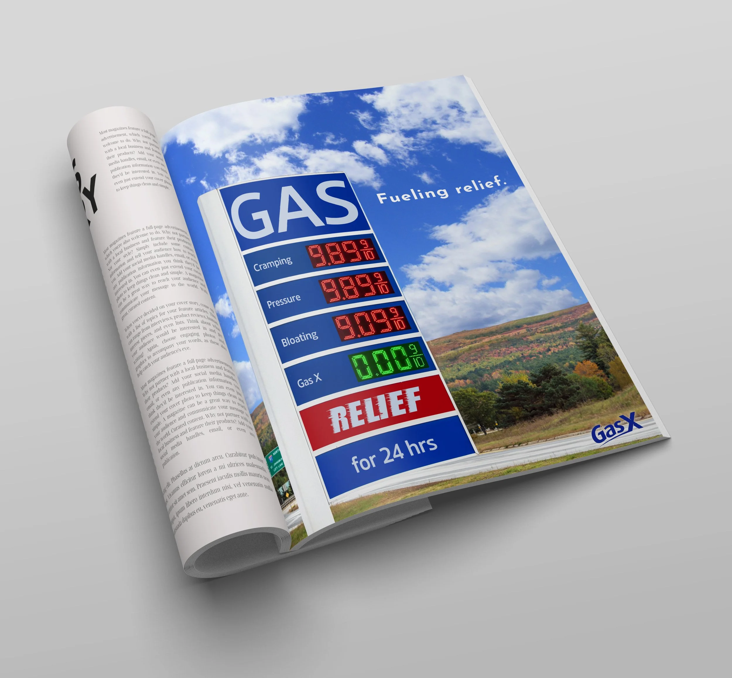
PRINT AD
The ad uses the gas station as a metaphor. With a high cost of cramping, pressure and bloating. Gas-X gives relief to all of those symptoms.
The inspiration for this advertisement stemmed from everyday items typically purchased at gas stations. The ad employs similar language, emphasizing keywords like "fuel" and "relief," to unify the campaigns.
Gas pump topper
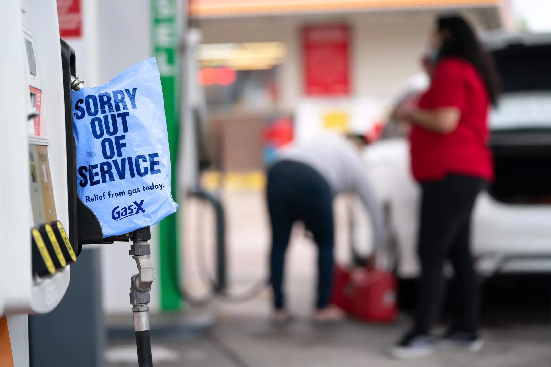
Guerilla Marketing
For this campaign, Gas-X would do a gas station takeover and shut down the pumps at all Gate gas stations. The out-of-service bag is typical siting when the pump is out of gas but these ones would be blue, have the Gas-X logo, and read, “relief from gas today.” The wording is a fun metaphor for the relief of intestinal gas and actual petrol. The intention of the marketing is to use an unconventional tactic to surprise their customers.
case study
Utilizing gas stations a metaphor we focus on finding relief from the discomfort of intestinal gas
BIg idea
For this campaign, we are targeting adults with gastro issues and anyone 18 and older who drives and who can associate rising gas prices at petrol stations with the rise of gas in their abdomen.
target audience
demographics
AGE: 18 & older
GENDER: All genders
INCOME: Middle class
psychographics
LIFESTYLE: Health Concious
PERSONALITY: Economical, sensible
INTEREST: Food blogging and travel
Type treatment
Below is an image from the Gas-X website. They use Josefin Sans in a dark blue throughout their site. I mimicked the same font for this campaign to remain on brand and create cohesion in their marketing.


